Thursday, 3 March 2016

Task 4, Evaluation...
I decided to make a range of designs for my logo. To make my logo look original. My designs are constructed around historical figures around medieval times. A peer advised me to use a selection of colours for my design. So I chose 11 colours. The person who I was designing the logo for wanted something that was original and not very common with other designs or copied. I based many of my images off art works and figurines. It was very hard to pick what sketch I wanted for my final design. In the beginning I decided to go for one design. I then decided that it was not as good and not as I wanted it so I decided I would go for another design. For my next design I used 10 colours. The way I designed my next image was more appropriate and had better placed colours. The colours that I had chose  seem not to be more eye catching. The design is aimed at a young and old audience.  However the main character in the design seems more appropriate to children. This design did not fully meet the client’s expatiations. Much of my design was not influenced by a variety of many logos however it seemed similar to some I found online.  


Royalty Free Medieval Stock Logo Designs


This logo resembles small similarities to my design. It shows a medieval character with a shield and a circle shape behind it. 


 This logo shows some similarities to my design. The character is in a circle and that parts of the image is going out of the perimeter. It also has the same theme of being medieval period type figure. The design has a similar timeline.


When I started this unit I first planned out my designs and sketches.  This helped me organise what I was going to do. It helped me plan out my graphic. The planning was very helpful to my idea and design. It also helped me work out which programs to use to design my graphic.
My decision to the final design was very hard because I had to choose which design was the best.

Over all I think I did well creating the graphic based image. I was able to put it on different media formats. I enjoyed creating this logo. There are many things that i should improve on to make my logo seem more professional. 

Friday, 5 February 2016

Select format :

The file that i use for my logos is mainly JPEG this is because the image can be placed on the internet. The file format itself is very popular among many professionals. The  quality is high but the compression is with a small degree.

The only problem with JPEG file formats is that it can not be edited unless re converted to pddf or something which is similar. The format cannot support transparency. The problem with JPEG and other raster files is that when the picture is increased in size the quality goes and the pixels begin to show.

https://www.youtube.com/watch?v=0X8nboil7-4


This logo in which i have designed is in a print platform. The logo is also in a interactive media form. Here it can be accessed and can take the user to the main page.


The link above shows the graphic in a moving image form. I uploaded  


The logo is also on a social media format. It is on instagram.


Wednesday, 27 January 2016

Consideration of audience:


 The merciful servant is a YouTube channel which posts similar content to my clients. Their design is a mixture of Arabic and English words. This logo is aimed for male and females. People who visit the channel are generally working people or students. The viewers are generally in the lower classes. These people are Muslims who would generally want to learn more about Islam. They would like to watch videos to remind them of things that they would forget and it would help them in their faith.
Nature of content:
I want to design a logo for a YouTube channel which uploads Islamic songs (nasheeds) and Qur’an. This logo I am designing reflects Islamic history.
My main idea is to draw a Saracen character which is a warrior in Islamic history. I’m designing this logo for people who are interested in “nasheeds” or people who are interested in Islamic history. My product only has a few colours: Brown, green, dark green, black and silver.

The files I’m going to use is jpeg because the pddf file cannot be uploaded as an image or as a file that cannot be edited. Jpeg on the other hand can be exported and uploaded on the internet as an image and cannot be edited.

Wednesday, 16 December 2015

Initial ideas for logo/graphic.

I want to design a logo for a YouTube channel which uploads Islamic songs (nasheeds) and Qur’an. This logo I am designing reflects Islamic history.
My main idea is to draw a Saracen character which is a warrior in Islamic history. I’m designing this logo for people who are interested in “nasheeds” or people who are interested in Islamic history. My product only has a few colours: Brown, green, dark green, black and brown.
The files I’m going to use is jpeg because the pddf file cannot be uploaded as an image or as a file that cannot be edited. Jpeg on the other hand can be exported and uploaded on the internet as an image and cannot be edited.

File formats: https://www.youtube.com/watch?v=0X8nboil7-4This is the image I first planned out to come up with my logo. It shows a character with a flag and a shield. I first came up with this as a sketch to plan out my first ideas.


I then designed my character in Adobe illustrator because I found the software very easy to use. The designing of the character was very hard and I found it very difficult. I had never used this type of software however I found it much easier to make my character then creating my character in Photoshop.

The font i used was myriad pro. I know this is the best font to use 


So I then decided I should colour my character with the tools in photoshop.

Here I blended in the sword with the flag I made the brush tool small and used the colour white. I used the paint bucket tool to colour the flag I also needed to blend the sword with the flag


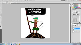
I then decided to copy my design and paste it in Photoshop where I coloured the figure, items and the mountain.
I used the paint bucket tool to colour wooden pole. I also changed the colours to paint the helmet and the turban.


I decided to change the colour of the turban to green because I preferred it.

I decided to make the clothing green as well as the turban. The flag is black with white writing. The reason I chose the design like this is because it has a contrast.
When painting the hill/mountain the problem was that when I tried to colour it the whole page became black. So I had to connect the right part of the3 hill/mountain to the left side.

I then used the paint bucket tool and made the hill black. Then used the paint brush tool and created little lines to show what the mountain is like. I then used the bucket tool to make the armour. I then found a sword online and I used the rectangular marquee tool (m) to get rid of the white background.


I used the bucket tool and I made the sword black.I copied the sword and I place it next to the other sword. I flipped it and resized it.


wanted to make the shield silver but I decided to make it green to blend in with figures clothes. 


I then decided to create another logo but I wanted to limit the design


I copied the figure from my previous logo.


I pasted it and I decided to create two lines to become the stick of the banner. I then placed a hand on the stick and made the material on the flag. I used the line segment tool.


I copied the flag from the other image.


Bold italic for the font.
Same as the previous font.


I used the paint bucket tool to colour the wooden pole the shield, armour, ­­­­­clothes and flag.


I then used the bucket tool on the background and the colour I chose was dark blue.


Friday, 13 November 2015

Unit 54 Digital Graphics for print : commercial logos

 Unit 54 Digital Graphics for print
1.       Semiotics
Denotation-Actual meaning what you see.
Connotations-Hidden meaning what it represents concept. Messages’ are.

FedEx – Delivery carrier/stands for federal express
Purple: establishment
Orange:
Recognise it because it’s global, institutional
Formal
Simple
Arrow


Amazon –
They deliver anything from A to Z
Smiley face
Arrow
Informal
Friendly


Chose 4 logos /graphics.
1.       Discuss semiotics and explain
2.       Analysis of text, colour, image? Layout
3.       Identify and explain target audience through your analysis and how it appeals
Anchorage: The text anchors more meaning to itself. It fixing of meaning
Eg. The copy text anchors (i.e. fixes to one spot) the meaning of an image (for instance, a single rose that could be used for an ad for anything from a dating agency to a funeral home) in a print advertisement.

The Pepsi symbol is a simple circle with 3 colours: Red, white and blue. The colours represent the American flag. According to this document the new logo represents the Earth’s magnetic field.
The colour is very basic and the white surrounds the shape but the blue ring forums the shape. The picture in away looks as if its unveiling from blue to red.
The image looks informal and it does not have any righting because people recognise the logo.
It stands out because of the 2 primary colours and the white stripe. Its audience is mainly people who want to drink fizzy drinks.  But it appeals to children. The reason why the logo doesn’t have its name at the bottom is because most people recognise it. The design of the logo is limited with the circle that surrounds it. This in a way makes the image distinct from the background. The logo is basic and it is not complex and is easy to remember. 


Mitsubishi Log
Originally the company was a shipping firm in the 1800.  It was a group of two families who emerged together to become a one company. The logo represents the combination of “crescents” of the”— three-leaf crest of the Tosa Clan and the Iwasaki family crest, which showed three diamonds stacked on top of each other.  The three diamonds are said to signify reliability, Success and integrity. They are coloured red because red denotes confidence and attracts customers to the brand.              
The audience is mainly adults and the image looks as if it’s formal.


The google logo has 4 colours which is the 3 primary and one green colour. Google wanted to show that they do not play by the rules and are also playful without making the symbol bulky and big. The way the logo is designed it is not formal because of the colours and the way the letters are structured. The way it’s laid out is all the letters are on one line except the g. It attracts mainly young adults or children. It’s the way the colour stands out. The colour of the “o” is different to the “L” this makes the word stand out. Also it is displaying their fun and bright ideas.


When the two founders of adidas made their company they decided to name the first part “adi”. This was because one of the founder’s names began with those 3 letters. “das” on the  other hand was the end name of the other founder. The “a” in the word is not capital and it gives a sense of being informal. The 3 pillar like structure represents a mountain to denote the struggles and obstacles people need to overcome in sports. It also forms a sprinting rack in away. The colour is plain black and it looks simple.
The audience is mainly people who play sports or need equipment and cloths related to sport.