Initial ideas for logo/graphic.
I want to design a logo for a YouTube channel which uploads
Islamic songs (nasheeds) and Qur’an. This logo I am designing reflects Islamic
history.
My main idea is to draw a Saracen character which is a
warrior in Islamic history. I’m designing this logo for people who are
interested in “nasheeds” or people who are interested in Islamic history. My
product only has a few colours: Brown, green, dark green, black and brown.
The files I’m going to use is jpeg because the pddf file
cannot be uploaded as an image or as a file that cannot be edited. Jpeg on the
other hand can be exported and uploaded on the internet as an image and cannot
be edited.
File formats: https://www.youtube.com/watch?v=0X8nboil7-4 This is the image I first planned out to come up with my
logo. It shows a character with a flag and a shield. I first came up with this
as a sketch to plan out my first ideas.
This is the image I first planned out to come up with my
logo. It shows a character with a flag and a shield. I first came up with this
as a sketch to plan out my first ideas.
 This is the image I first planned out to come up with my
logo. It shows a character with a flag and a shield. I first came up with this
as a sketch to plan out my first ideas.
This is the image I first planned out to come up with my
logo. It shows a character with a flag and a shield. I first came up with this
as a sketch to plan out my first ideas.

I then designed my character in Adobe illustrator because I
found the software very easy to use. The designing of the character was very
hard and I found it very difficult. I had never used this type of software
however I found it much easier to make my character then creating my character
in Photoshop.
The font i used was myriad pro. I know this is the best font to use
The font i used was myriad pro. I know this is the best font to use
So I then decided I should colour my character with the
tools in photoshop.
Here I blended in the sword with the flag I made
the brush tool small and used the colour white. I used the paint bucket tool to
colour the flag I also needed to blend the sword with the flag


 I
then decided to create another logo but I wanted to limit the design
I
then decided to create another logo but I wanted to limit the design

 I pasted it and I decided to create two lines to become the
stick of the banner. I then placed a hand on the stick and made the material on
the flag. I used the line segment tool.
I pasted it and I decided to create two lines to become the
stick of the banner. I then placed a hand on the stick and made the material on
the flag. I used the line segment tool.


 I then used the bucket tool on the background and the colour I
chose was dark blue.
I then used the bucket tool on the background and the colour I
chose was dark blue.

I then decided to copy my design and paste it in Photoshop
where I coloured the figure, items and the mountain.
I used the paint bucket tool to colour wooden pole. I also
changed the colours to paint the helmet and the turban.

I decided to change the colour of the turban to green
because I preferred it.
I decided to make the clothing green as well as the turban.
The flag is black with white writing. The reason I chose the design like this
is because it has a contrast.
When painting the hill/mountain the problem was that when I
tried to colour it the whole page became black. So I had to connect the right
part of the3 hill/mountain to the left side.
I then used the paint bucket tool and made the hill black.
Then used the paint brush tool and created little lines to show what the
mountain is like. I then used the bucket tool to make the armour.  I
then found a sword online and I used the rectangular marquee tool (m) to get
rid of the white background.
I
then found a sword online and I used the rectangular marquee tool (m) to get
rid of the white background.
 I
then found a sword online and I used the rectangular marquee tool (m) to get
rid of the white background.
I
then found a sword online and I used the rectangular marquee tool (m) to get
rid of the white background.
I used the bucket tool and I made the sword black. I copied the sword and I place it next to the other sword. I
flipped it and resized it.
I copied the sword and I place it next to the other sword. I
flipped it and resized it.
 I copied the sword and I place it next to the other sword. I
flipped it and resized it.
I copied the sword and I place it next to the other sword. I
flipped it and resized it.
wanted to make the shield silver but I decided to make it
green to blend in with figures clothes.
 I
then decided to create another logo but I wanted to limit the design
I
then decided to create another logo but I wanted to limit the design
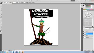
I copied the figure from my previous logo.
 I pasted it and I decided to create two lines to become the
stick of the banner. I then placed a hand on the stick and made the material on
the flag. I used the line segment tool.
I pasted it and I decided to create two lines to become the
stick of the banner. I then placed a hand on the stick and made the material on
the flag. I used the line segment tool.

I copied the flag from the other image.

Bold italic for the font.
Same as the previous font.

I used the paint bucket tool to colour the wooden pole the
shield, armour, clothes and flag.
 I then used the bucket tool on the background and the colour I
chose was dark blue.
I then used the bucket tool on the background and the colour I
chose was dark blue.


